Unlocking the Power of Data: How BizMachine's Petr Kalat Reveals the Secrets to Quick Company Assessments Indicators
An interview with our colleague Petr Kalát to better understand the purpose and significance of the Activity, Growth, and Availability indicators featured on our Prospector tool
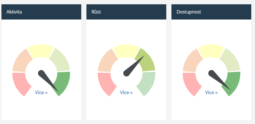
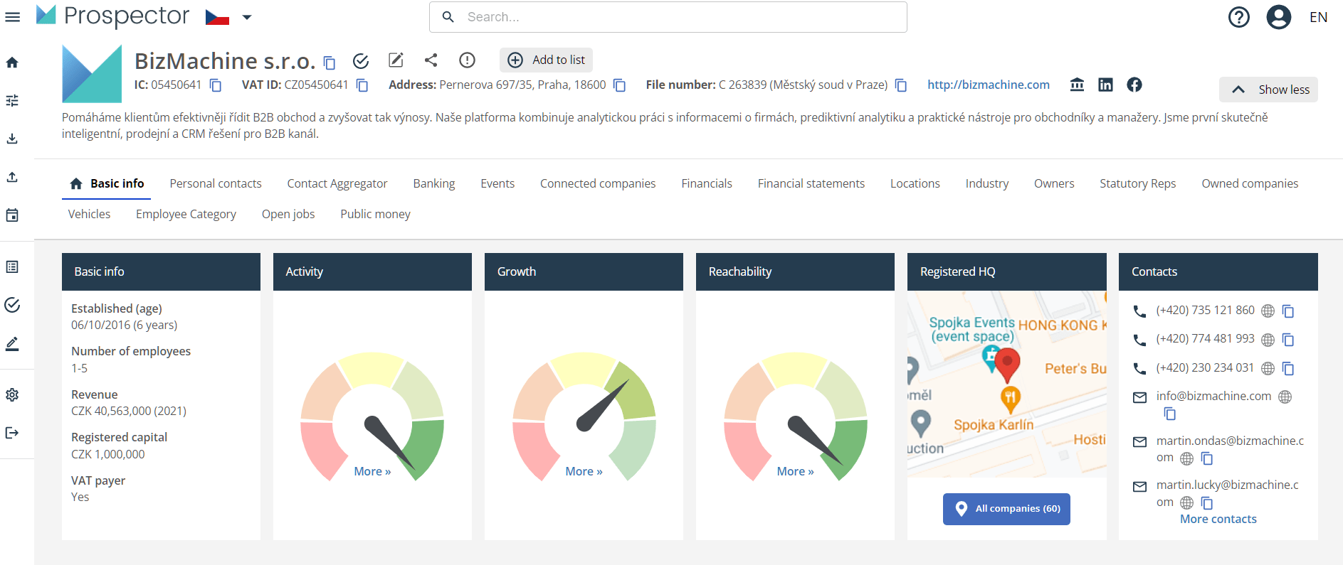
You might be aware, that our Prospector provides access to a comprehensive live database of Czech, Slovak, and German companies. Its three “indicator lights” offer a quick evaluation of a company's status, reminiscent of the mechanical petrol level indicators in cars. The first two lights indicate whether the company is active or available, while the third light, with an arrow in the green box, signifies growth. Though simple in appearance, these indicators are backed by exhaustive data and meticulous effort.
We spoke to Peter Kalát, one of the creators, about the inspiration and significance behind these BizMachine indicators.
What was your reasoning behind the creation of BizMachine indicators in Prospector?
We have a considerable amount of data. For that data to benefit our clients, we need to serve it in an understandable and comprehensible way. Suppose you're interested in looking at a particular company and opening their profile in Prospector. In that case, you want to avoid downloading an Excel spreadsheet with 300 rows of disparate data, spending half an hour going through it, and wondering what you should take away from it. You need to know quickly if and how active the company is or if contacting them is possible. And that's precisely what our BizMachine indicators in Prospector are for; they're not just data. It's simply data that's visually digestible.
What is the value of these indicators?
It's a great way of communicating substantial amounts of data so that our clients get the information they need almost instantly. Our indicators account for over 200 indicators from over 50 data sources. And as a user, you don't even need to see or know. Without much thought, you can absorb much information at a glance in no more than 2 seconds. And in an obvious and user-friendly way. The company is green, orange, or red. Excellent information at first glance. But it takes time to find the key to quickly visualize large amounts of data to ensure everyone understands what they're looking at without explanation. But once you have that data representation, it seems logical and straightforward.
Can you describe more about what sources and data go into BizMachine indicators?
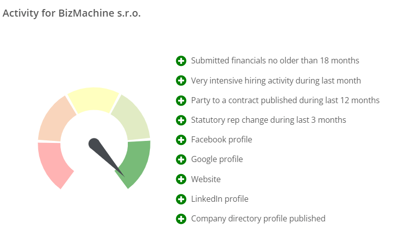
Almost all the data we collect about companies in BizMachine plays a role in our indicators. Most of it goes into the activity indicator, which is the most complete and comprehensive. Over 150 signals enter it. These include whether the company has a functional website, has registered a new branch, is buying company cars, is participating in public procurement, has won a tender, or is actively looking for people on job portals. We have all this information. Well, if we link them together, half the job is done. The second step is to scan each signal. That is to say, whether it positively or negatively affects the company's overall activity. So while recruiting people is a positive point, a broken website or insolvency are negative markers.
And do all signals carry the same weight?
Absolutely not. Some things have a more significant effect, and others less. So the valuation of a given signal enters into the overall score. If a company had a recruitment advert a year ago, it's not as strong signal as if it's looking for people now. Similarly, a completed profile on Firmy.cz is a weaker signal than an active ad.
Can you explain the last example? What is the logic behind it?
You fill out the profile on Firmy.cz once, and you have it. We cannot know whether you are still in business and whether it is correctly filled out, up to date, and fresh. Moreover, it costs you de facto nothing – neither time nor money. But if you're paying for an advert, you must have written it and paid for it, too, so it's a stronger indication that you're now acting as a business. It's important to say that those indicators are not static. If there is a significant change in a company, the difference will show up almost immediately. In fact, we update most of our data daily.
Oh, I see. And does the company's size play a role in the activity indicator?
Some of the signals we've selected will correlate with the company's size. After all, big brands get more media coverage, may be sought out by more people, may have more frequent changes, and so on. But we're not about competition. We're looking for something other than the most active company in the country. We're about comparing companies to each other, but we're not putting out an overall score but a relative comparison to others. The way it works is that you label all the signals according to whether they have a positive or negative impact and how significant a role they play. You do the math. You come up with a number but don't show it anywhere. It wouldn't tell anybody anything. So you normalize the total population of companies. That means you line those firms up and rank them on a scale, say, from 0 to 100. And then, we show that scale with an indicator light arrow and a color. So you don't say this company has a score of 370; that would be useless. Is that too much? Is it not enough? You say this company is green. So it's active and more likely to be a better target for my sales pitches than a red company, which means it has some more fundamental problems. In short, our indicator lights offer easy-to-understand aggregated scoring data that you know your way around without necessarily needing to see any numbers.
But color isn't the only thing I see on my indicator lights, right?
Color serves as a basic orientation. If you are interested in detail, click on the indicator. You can see at most 10 to 15 most significant signals written on the company's final classification in one category or another. And you can see straight away whether they were plus or minus points. For example, if a company is super active but is laying people off, it will be green, but when you click on it, you will see that layoff with a red minus at the end. If you're interested in detail or more depth, we'll offer it to you transparently in one click. And by the way, you can also see what the score was calculated from. And this again demonstrates nicely all the data we collect in BizMachine and what we know about companies.
How long did it take to calibrate that so that the data you're displaying fits and is valuable?
Our clients use our data; if it needs to be more accurate or working correctly, they give us feedback immediately. We have calibrated some indicators with extensive quantitative feedback from a large call center. We listen to our customers and know the indicators are correctly set up based on what brings value.
You describe it all clearly, so I suppose you are the originator of the whole idea.
Well, I am the closest thing to what can be called the author of the indicators. But I think Martin Nepraš, one of our three founders, came up with the whole idea in 2017. Even then, we had a lot of data, and there was a plethora of information coming out of it, and we were thinking about how best to mine and use it. Well, two or three people came up with the idea of aggregating our data to derive some concrete, synthetic value. And that's how the idea for these indicators came about. And I love the fact that, all these years later, the idea is still working. Our indicators are a great way to show and visualize the amount of data we have in a way that is useful and gives a clear indication at a glance of where a company stands..

Petr Kalát is a Data Engineer. He works with us at BizMachine since March 2017.
